A beige sofa that seems dull, a white wall that the light crushes at noon, mismatched cushions bought five years ago: this is often where we start when we want to update an interior. This year’s decor trends offer concrete ideas to address these irritations without a complete overhaul.
Two main themes structure the current collections: softer light bases than pure white, and raw materials that provide visual density without being heavy.
Cloud Dancer and Transformative Teal: two color references to know before painting
When choosing a shade for a wall or furniture, you quickly find yourself with hundreds of color swatches. Professional references help make a decision. Pantone has designated Cloud Dancer (PANTONE 11-4201) as the color of the year 2026: a slightly off-white, soft and luminous, designed as a warm base rather than a clinical white.
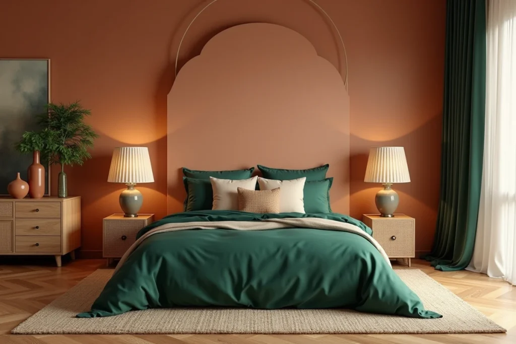
Meanwhile, trend offices WGSN and Coloro have named Transformative Teal as the key color for 2026 decor. This deep blue-green works well as a flat color on a wall or in accessories (vases, cushions, lampshades) to create a focal point.
You can combine these two references in the same room. A living room painted in Cloud Dancer immediately gains warmth compared to standard white, and a chair or rug in a tone close to Transformative Teal is enough to anchor the atmosphere.
No need to repaint the entire house: one wall and a few coordinated accessories can change the perception of space. To explore these combinations further, the decor trends according to Votre Déco detail several color associations suitable for each room.
Dark wood and chocolate brown: the palette favored by designers
Popular decor media still highlight sandy and beige tones. On the professional side, the direction is more pronounced. According to a DécoraForum summary, one third of world-renowned designers cite chocolate brown as the color of the year. This gap between public communication and on-the-ground choices explains why some recently renovated interiors already seem dated.
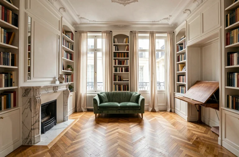
Dark wood is making a strong comeback in furniture: walnut coffee tables, stained oak shelves, ebony-finished consoles. The idea is not to recreate a 1970s living room, but to pair these dark pieces with light walls (Cloud Dancer, for example) to achieve a sharp contrast.
Warm metals instead of chrome
Brushed brass and patinated copper are gradually replacing chrome and brushed steel in lighting, furniture handles, and table legs. These warm metals naturally complement dark wood and chocolate tones. Feedback on the durability of unvarnished brass varies, but occasional maintenance with a soft cloth is enough to maintain its original appearance.
Bright scenario: organizing lighting in layers rather than points
A central ceiling light is often installed, and the subject is considered settled. Current trends in interior architecture push towards lighting distributed in three layers: accent, ambient, and functional. Each layer corresponds to a real use of the room.
- Accent lighting highlights an object, a painting, or a niche. A small adjustable lamp or recessed spotlight is sufficient.
- Ambient lighting (dimmer floor lamp, string lights, LED candle) creates an evening atmosphere without glare.
- Functional lighting (desk lamp, under-cabinet lights) serves a specific task: reading, cooking, working.
You can test this principle in a living room without renovations: turn off the ceiling light, turn on a floor lamp in a corner, and a table lamp near the sofa. The difference in visual comfort is immediate. A table lamp costing less than thirty euros can already make a difference.
Natural materials and rounded shapes: what works room by room
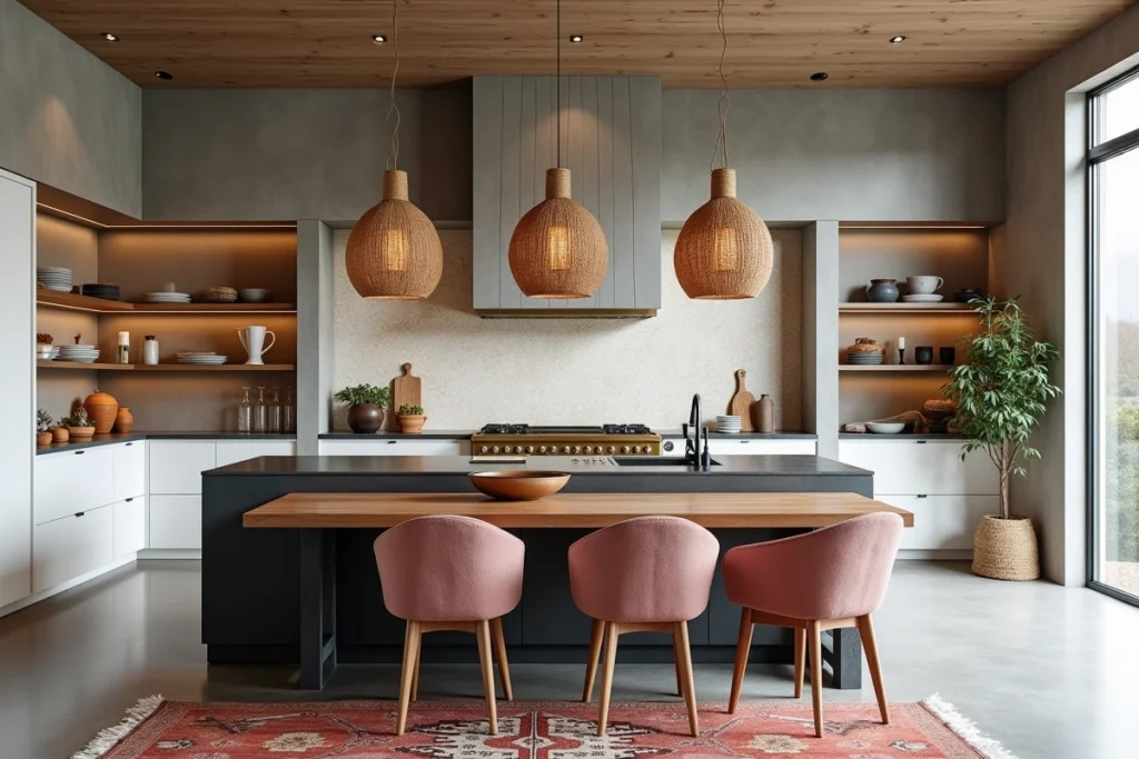
The return of raw materials (linen, rattan, ceramics, boucle wool) is not limited to living room decor. They are now found in all rooms, including the kitchen and bathroom.
Living room and lounge
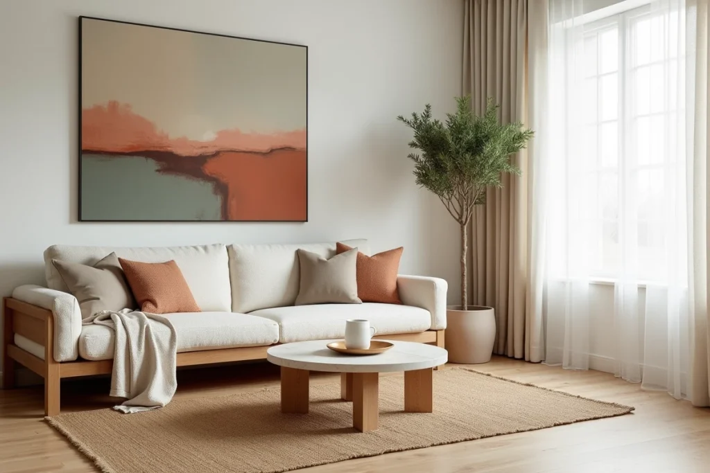
A washed linen sofa, a jute or wool rug, textured fabric cushions. Rounded shapes in furniture (soft edges on coffee tables, curved backs) soften the rectangular volumes of standard apartments. One piece of furniture with curved lines is enough to break the rigidity of a room.
Kitchen
Natural wood or matte finish fronts replace glossy finishes. Brass or woven leather handles add a handcrafted touch. On the countertop, stone-effect ceramics are gaining ground against uniform quartz.
Bedroom
Wrinkled linen bedding remains a safe bet. Rattan or ribbed wood headboards are also appearing, adding texture without visually cluttering the room.
- Favor materials that age well: linen patinas, solid wood can be restored, ceramics resist shocks.
- Avoid overly homogeneous combinations: mixing two or three materials in the same room creates depth.
- Test before buying: ordering fabric or paint samples remains the most reliable way to avoid tone errors.
This year’s decor trends converge towards a simple principle: fewer smooth and cold surfaces, more textures and controlled light. A wall repainted in a warmer white, a repositioned light fixture, a dark wood piece replacing a white melamine item, is often what transforms an interior without a huge budget.